Below is a brief summary of the differences between the new v old membership design (released in Feb 2021).
The form itself has pretty much the same flow as before - just the UI design is slightly different with a fresh new look and a cleaner design.
NOTE: the comparison below is just of the major parts of all forms - depending on the organisation they may also have other pages for members to fill out before or after these sections.
MEMBERDSHIP HOMEPAGE
This will be different for every org - this is just a comparison of how one homepage may look before and after.

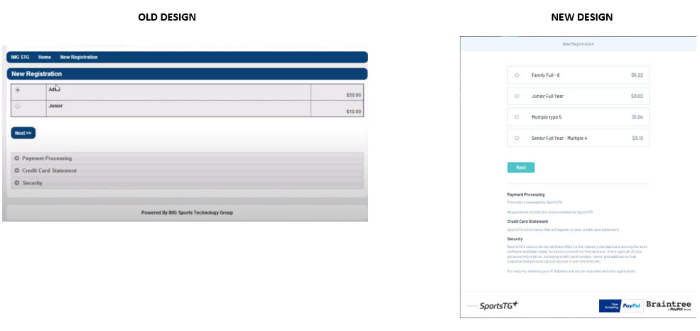
NEW REGISTRATION SELECTION
- This page will be the same for an existing member as well - they will just have logged in before this screen.
- Cleaner design, new colour scheme and larger buttons

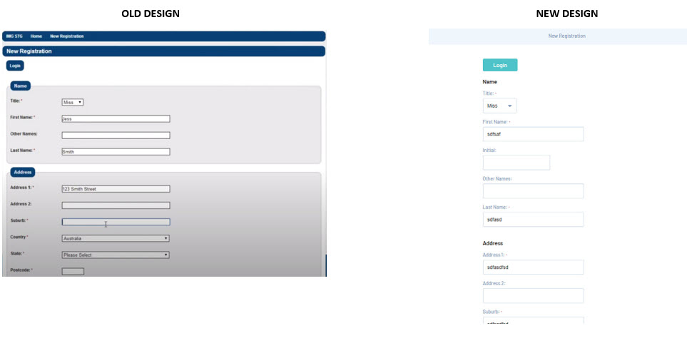
MEMBER INFORMATION SCREEN
- Slimmer design, improved question layout, larger buttons/fields
- Incorporates a cleaner design and new colour scheme

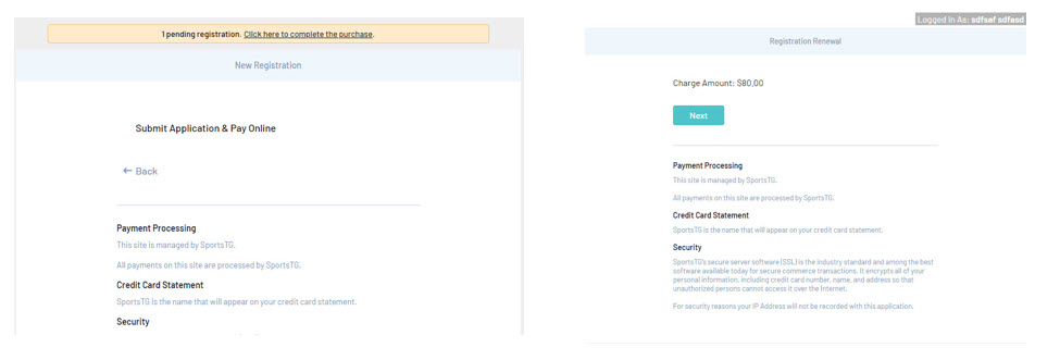
CONFIRM REGISTRATION AND PRICE/PRODUCT SCREEN
- two extra steps have been added (these were previously at the end of the form where you selected your payment method). This change allows members to confirm they want to continue and to check the correct price/product for that member before paying.

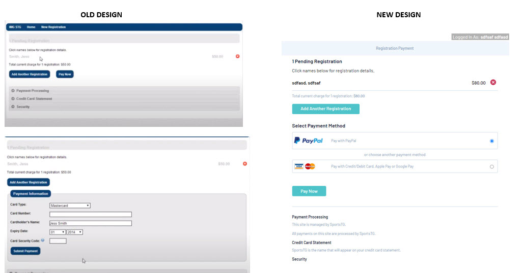
PAYMENT SCREEN
If members wish to register another person they can do it from this page by clicking on ''add another registration''.
- Payment Method options are stacked
- Incorporates a cleaner design and new colour scheme
