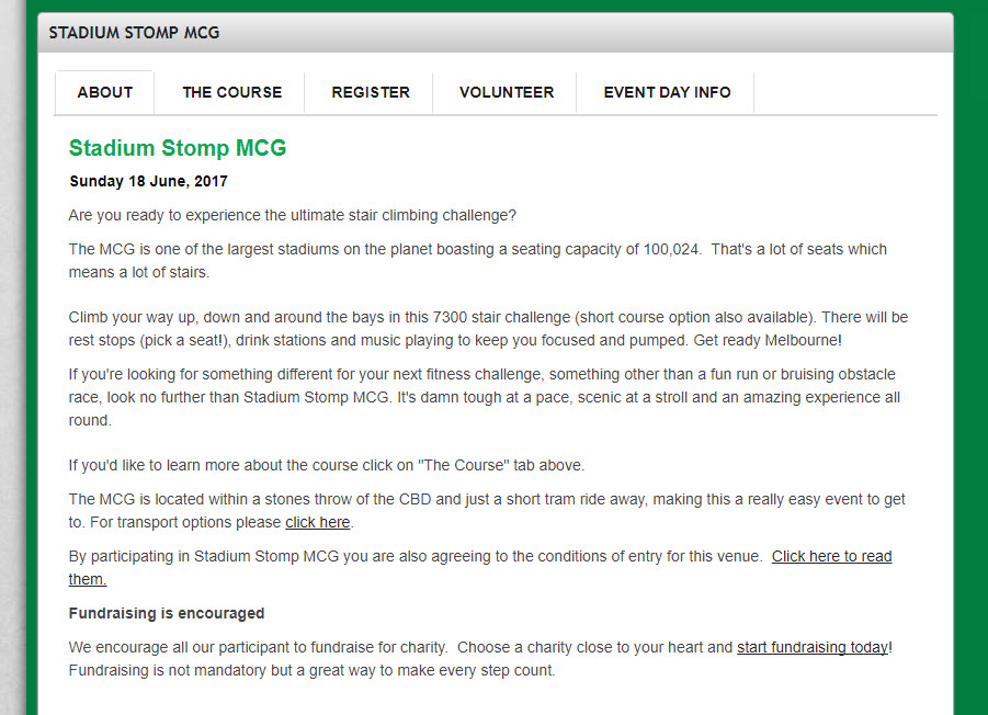
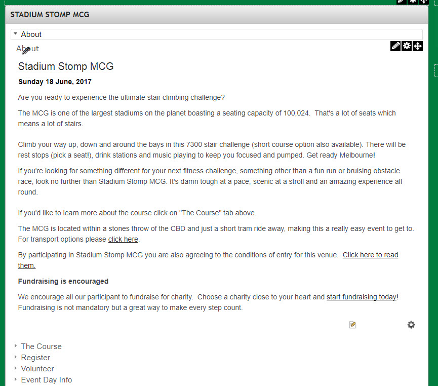
The tabs system is used to hide and show specific content on a given page in order to categorise it without the need to view multiple pages
Adding the Tab module
-
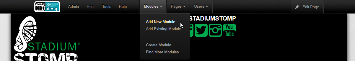
After you have logged in, click "Modules" > "Add New Module"
-
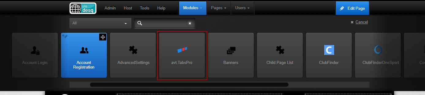
Drag the horizontal scroll bar to until you can see the "avt.TabsPro" module and then click and drag the module onto the page.


Moving Modules to sit inside the tabs module
-
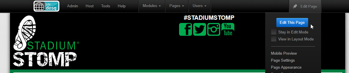
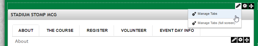
After you have logged in, Edit the current page by going to Edit Page > Edit page
-
Hover over the pencil up the top right hand corner of the module and click Manage Tabs(full screen)
-
Under the Items Heading click the "New Tab" button
-
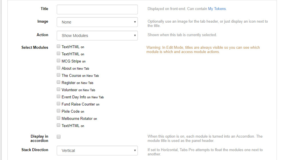
Below the image is a list of instructions what to do with the settings
-
Title: Displays as the tab or accordion title (it can be separate to the module titles).
-
Image: Adds an image next to the tab title (1), below is a description of what each option does:
- None: Simply does not display an image.
- Icon (from portal files): Allows you to select an image from your portal file structure, folders can be navigated to on the left and an image can be selected on the right.
- Icon (from URL): Allows you to select an image accessible from the internet e.g. Console Assets.
Please note that we do not recommend using recources that are outside of your control. - Font Awesome Icon: Select from a pre-defined list of icons
- Image header: Select a background icon and states for when the current tab is selected or hovered over by the mouse.
-
Actions: Allows you to choose whether you want to open the content on the current tab or to redirect to another module.
-
Select Modules: Choose the modules that will be displayed in the current tab.
-
Display in accordion: Make the modules inside this tab display as an accordion menu. This can be useful if you want to categorise information again within tabs.
-
Stack direction: Set the modules inside the current tab stack horizontally or vertically
-
Default Tab: Sets this tab to be open on page load
-
New Tab Button: Add the first tab or add additional tabs
After you have specified your tabs, click the "Save" button up the top right hand corner of the page.
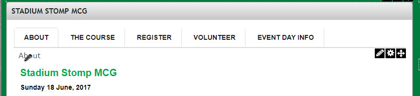
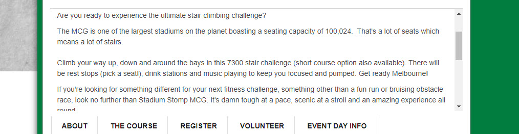
Here is an example of five tabs with no images with a single module in each tab.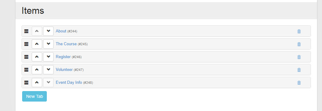
This provides the following output

-


Tab Settings
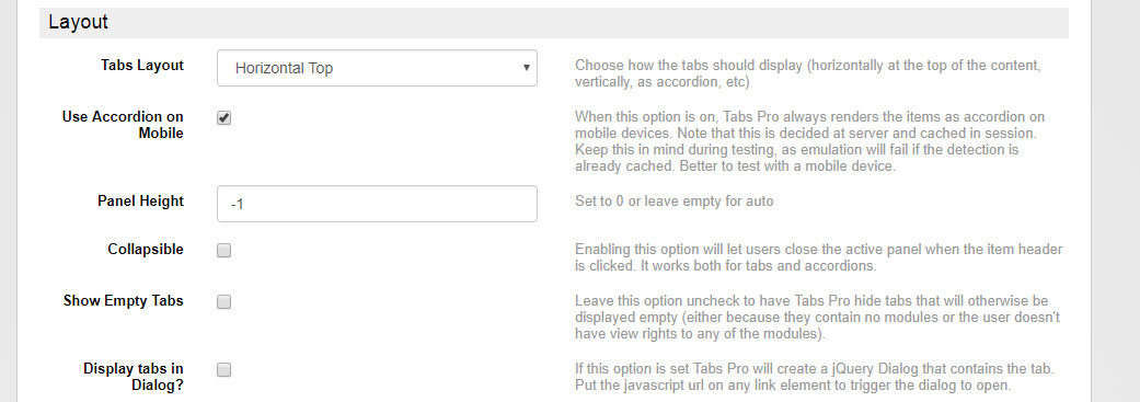
The tabs settings can generally be left to their default values, however there are different layouts that can be utilised, explanations are available under the following image
-
Tabs Layout: Displays how the text
-
Horizontal Top
-
Horizontal Bottom
-
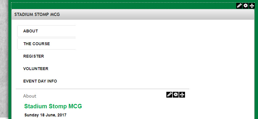
Vertical Left
-
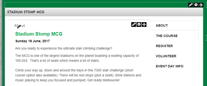
Vertical Right
-
Accordion
-
-
Use Accordion on Mobile: Change the tabs menu to an accordion menu on mobile devices, this is useful as multiple tabs can take up more horizontal space.
-
Panel Height: Sets the minimum panel height before content is added.
-
Collapsible: Lets a user click the currently selected tab to hide it's content
Initially Collapsed: Starts all of the tab content closed.
-
Show Empty Tabs: Will continue to display tabs even if there is no content in them
This is useful for content that is hosted on separate websites (e.g. Facebook)
-
Display tabs in Dialog?: Brings up and interface that allows you to call a window with tab content separately.
-
UI Settings Widget Provider
-
Bootstrap: Uses Twitter's bootstrap system to render tabs, this is the recommended system for most SiteDesqPro websites.
-
JQuery UI: Calls an additional platform to render tabs.
-
jQuery UI Theme Location: Allows you to select a local server, CDN or external link to load jQuery.
CDN links can be useful as a user might not need to download jQuery UI tab library if they have previously done so on another website.
- Theme Name: Select a jQuery UI theme
-
-
-
Transition Effect: Add a Fade effect for Bootstrap or choose between Fade, Slide or Fade and Slide for jQuery
-
Open on Action: Allows a user to change tabs from either clicking or by hovering over a tab.
-
Auto Scroll: Scrolls the window down to the tab content when you click a tab if the page is longer than the tab system.
-
Show When Fully Loaded: Only have tab icon available once the tab content has been initialised.
-
Tab Persistence on Postback: The same tab will stay open if you refresh the current page or if you client the "back" button in your browser after navigating to a different page.
-
Tab Persistence in Url Bookmark: Adds a anchor to your URL that allows the tab to start open.
-
Tab Persistence in Browser Cookies: Creates a file within your browser that remembers which tab was open on the page.
-
Save Button: Click this to save changes.


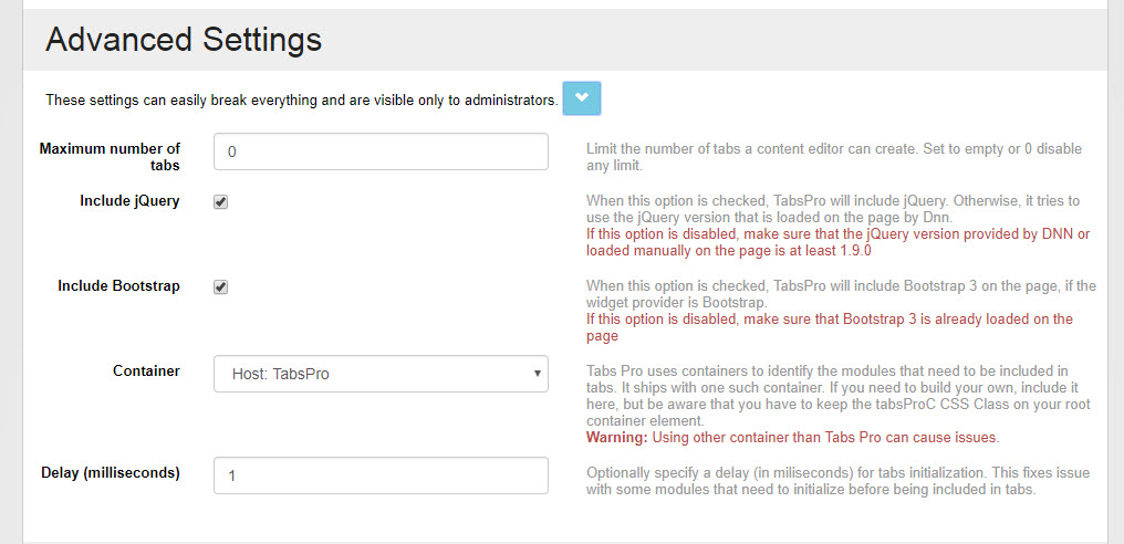
Advanced Tab Settings
These advanced settings generally don't need to be changed (except to change default tab container to the IMGSTG one) .
-
Maximum number of tabs: Change the amount of tabs that can be created.
-
Include jQuery: Allows the system to not load a version of jQuery if it is already running in the website skin to reduce page load times.
-
Include Bootstrap: Allows the system to not load a version of Bootstrap if it is already running in the website skin to reduce page load times.
-
Container: Allows you to specifically change the wrapping container for the module, if it is available we recommend changing the option to Host: IMGSTG_Tab
-
Delay (milliseconds): Forces the module to wait for the specified amount of time before running, this can be used if there are some plugins that require to be loaded after the page loads, e.g. the Facebook Page plugin.
-
Append IDs to bookmarks: This option allows there to be no conflicts between different tab modules on the page to be bookmarked, if there is only one module on the page you can deselect this option to better generate content for bookmarks.